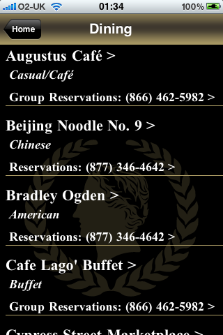
You can’t imagine how excited I was to see an offiical Caesars Palace iPhone app appear on the App Store recently.
It came with a big boast too: “The Caesars Palace Mobile application is a travel companion that can elevate your trip from ordinary to legendary”.
Sadly, I beg to differ. It’s a bit of a turd.
The app weighs in at a tiny 0.4Mb, which tells you it’s going to have to fetch most of its data from the network.
This is good and bad. It’s easy for them to update information when it changes (it’s Vegas – things change frequently) but it alienates iPod touch users and visitors from outside the USA who don’t want to get stung by horrendous data roaming charges, pay extortionate hotel wifi charges, or go to the effort of getting their iPhone unlocked and using a local SIM.
iPod touch users are also screwed over on the included gimmick to put your own photo onto a Caesars Palace sign. It only works with the iPhone’s camera – you can’t use a picture from your photo library. Although it’s a pretty piss poor effort at slapping two photographs together anyway. I tried it with an old friend.

The other information you get is a subset of what you can find on the Caesars web site, thrown together in a style reminiscent of web sites from 1995, except without a hit counter or an animated “men at work” image.

The part I was really interested in though was how I would be able to “use Caesars Palace Mobile to find [my] way around the resort”, like they claimed.
Let’s face it. If someone describes the floor plan at Caesars as “all over the place”, they’re being kind.
For what it’s worth, I actually find that meandering mess of a maze an endearing feature of a property which has evolved and grown in character over more than 40 years. It’s just a nightmare to get to where you want to be.
So, what technological wonders that take advantage of the iPhone platform have they used to help you find your way?
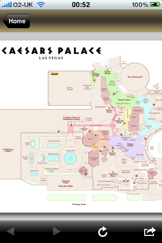
It’s a map.

It’s the same map that you get when you check into the hotel or if you can pick up around the casino.
The user experience is somewhat different, however. When they print maps, they tend to make sure that they’re readable, and they generally print them larger than three inches in size. This is is pretty standard because, well, it just works.
Above is an actual size screenshot. Tell me where Total Rewards is, or how to get to the Augustus Tower from the parking garage.
I’m being a little unkind. You can actually zoom in enough so that the text size is almost the same size as it would be in print. Of course, once the text is readable, you can only see a fraction of the map.
I guess it’s nice to have a map graphic on your phone though. I’ve used that kind of thing before, with zooming and panning and what not. I’d probably use this one too if it actually stayed downloaded to my phone long enough to use it – instead of requiring a significant download every single time you navigate away and come back. It takes a good 5 seconds over wifi and 25-30 seconds on 3G. (I didn’t bother trying over EDGE). They should at least cache it within the app for a couple of hours.
I should probably have seen this coming, when the first thing in the product description is an attempt to claim that this is a “beta” release – despite being publicly available to anyone with an iPhone or iPod touch, and carrying a 1.0 version number.
Disappointing as the app is, it’s even more disappointing that Caesars Palace would put its name on what is clearly a work in progress.

Comments