It looks like it is becoming the norm that every Las Vegas casino has to have it’s own promotional iPhone app. It’s such a shame that the ones I’ve seen so far have failed to live up to the hype.
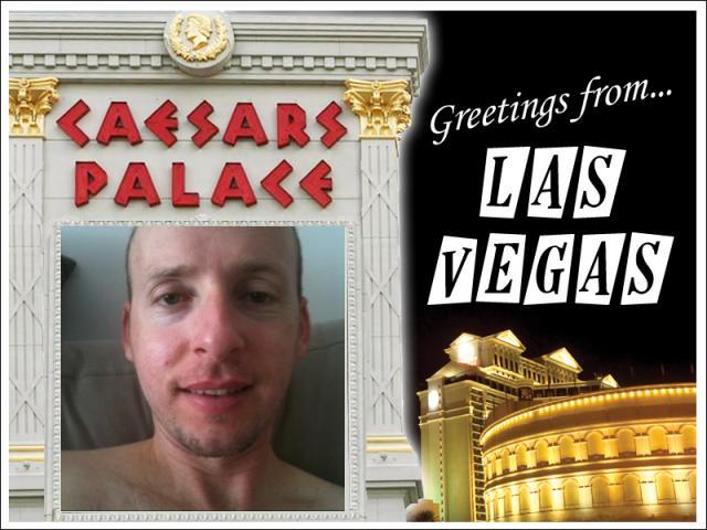
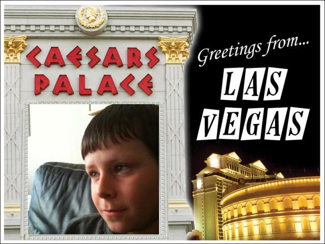
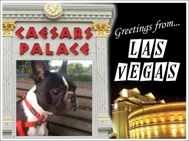
I’ve already let my thoughts be known about the Caesars Palace app, and I still keep on checking back to see which of their customers’ pictures they’ve passed on to total strangers lately. It’s disgraceful that this is still going on. Be it man, child or dog – they don’t discriminate.
 |
 |
 |
MGM Mirage have now entered the fray with apps for three of their hotels: MGM Grand, Mandalay Bay and New York-New York.
They’re all much the same. The brief probably read: “like the web site, but more iPhone-y”.
Well it mostly meets that brief, and where it wasn’t possible to make things iPhone-y enough, they just ship you off to parts of the web site instead.
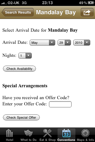
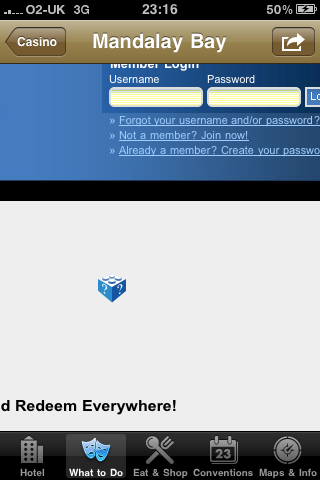
Like for reservations, which has a special mobile version just for this screen size – although it comes at the expense of no longer looking like it’s part of the app. That’s more than can be said for the player’s club link. Below is as much as you can see at any one time (you can’t pinch to zoom out). I don’t think they got the memo about Flash not playing on the iPhone, either.
 |
 |
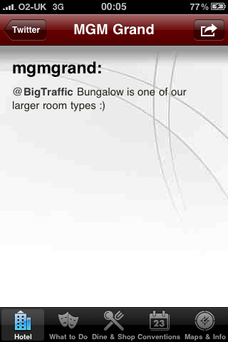
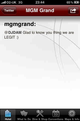
You have to include Twitter these days. It’s the law. Here’s how: first you pretend everyone cares about this junk, then you assume that they don’t already have a more convenient way to read it. Loading each little nugget of crap separately is just about perfect.
 |
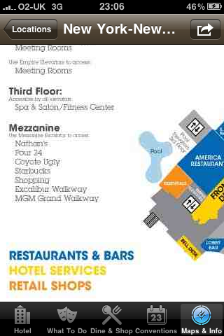
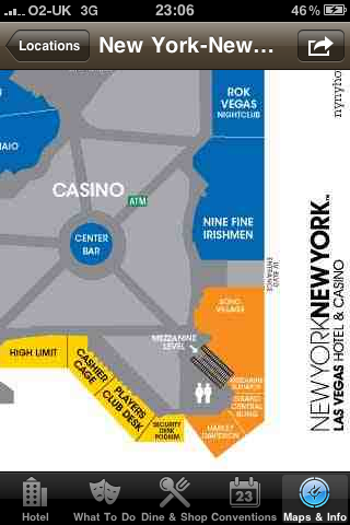
Finally, throw in an unscalable, nastily-compressed copy of the floor plan and you’re good to go.
 |
 |
Maybe I am just a little too picky about this kind of stuff. Or maybe I’m just jealous of whoever got this job, and annoyed that the contract went to someone who doesn’t appear to care about the image their corner-cutting is portraying for the resorts involved.
I’ll admit that I don’t really give two hoots about NY-NY, and if I was developing this it would be tough not to include a hysterical laughing sound if someone tapped a button that said “I want to eat here”.
But MGM Grand and Mandalay Bay are – like Caesars – primo properties. Huge, huge Las Vegas brands. They deserve so much better than this.
So do I have anything nice to say today? Not about these apps, but MGM Mirage did release one other iPhone app last week – an “augmented reality” browser for the Las Vegas Strip.
Or at least for the half of the Strip that’s dominated by their hotels. Although it includes the neighbouring Tropicana and Paris, once you get north of Flamingo Road, you’re on your own.
Even though I haven’t had chance to try this out on site yet, I like the concept and, assuming it works just as well in reality as it does when you simulate being there, I like the way it behaves. I know my way around town pretty well but I can still appreciate this as I still haven’t got my head around which part of CityCenter is which.
Veer is the one that looks like it’s falling over. Harmon’s the one that actually might. Beyond that…
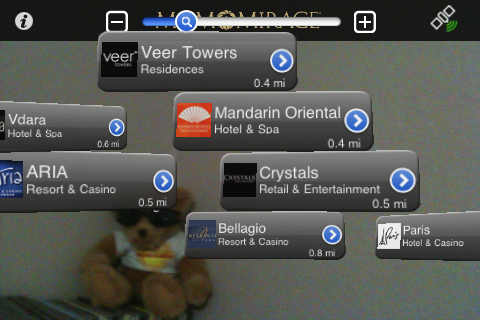
The simulation mode virtually puts you on the Tropicana Avenue intersection, and from there you can spin around 360 degrees and see what hotels would be in view. In this case, It showed me a bunch of casinos out there, in the corner of my office, just behind Summerfest Bear.
It might not seem like a big deal at first, but showing the distances on here is brilliant. These buildings are so huge, you can lose all concept of size and distance.
When you think, “What’s that big pyramid thing? It can’t be far away – let’s check it out!”, this app can help to put things in perspective.
And when the sun is beating down with triple-digit heat and you still think walking from Bellagio to Luxor sounds like a great idea, it may actually save lives.

[…] Excerpt from: Las Vegas iPhone apps suck balls, save lives | The Lucky Donut […]
[…] The Wynn proudly announced a new iPhone app today and I was keen to see if they’d managed to make a better job of it than Harrah’s or MGM. […]